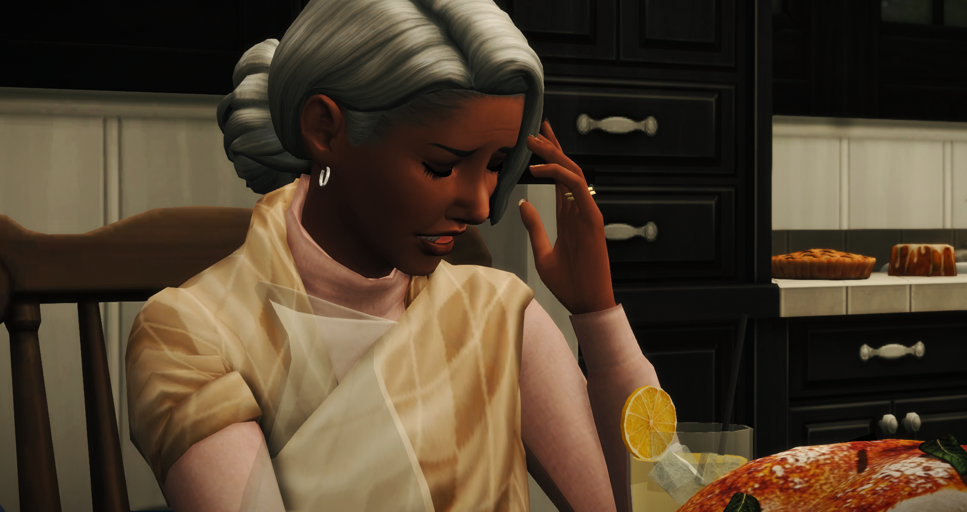


Hey folks! Did you enjoy the memory lane posts? I know I did! Before we jump back into the story, I want to give you a heads up. For the TL;DR folks, I’m rebranding The Piersons and Friends, so be on the lookout for new banners, colors, etc.
For those who enjoy my thought process, board my train of thought under the cut.
A year or two ago, I gave my blogs one cohesive look. I wanted to brand myself! So I made this banner and have been using the colors and fonts from it for everything.
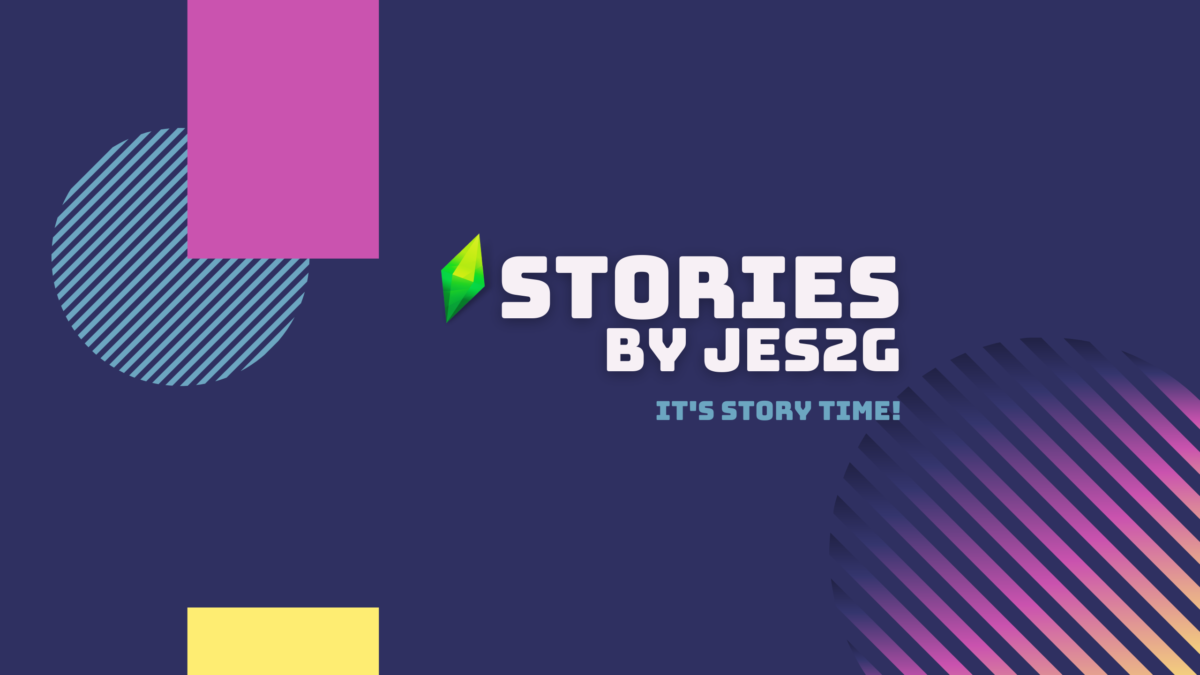
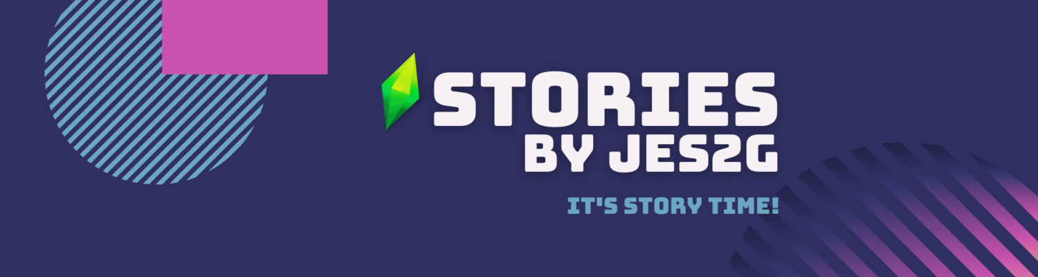
In the spirit of rebranding, I also remade the banners for PnF to match this new style.
Recently, I realized this was a mistake. I make different banners for my stories to give them their own identities. Changing PnF’s assets to match the blogs essentially took away its identity, and that’s probably why I’ve felt a bit unsettled when looking at it lately; it didn’t work for me anymore. I needed to change it, but to what?
This story is a rotation, but it’s also the story of a family, the Piersons. That’s why I used trees in the previous banner. The tree also reinforces the organic feel I want. The story is funny sometimes, but it’s not a comedy. It’s sometimes dramatic, but it’s not a soap opera. It’s everything all at once and flows in and out of various emotions seamlessly–organically!–which is why script fonts work well for the title. Looking back at old banners, I had those elements and didn’t even realize what they meant and how well they worked.

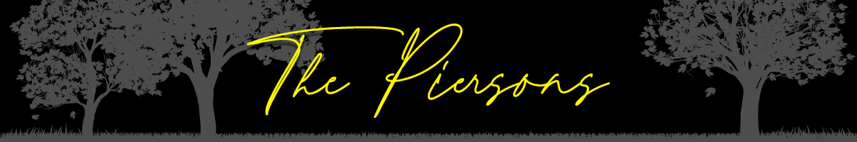
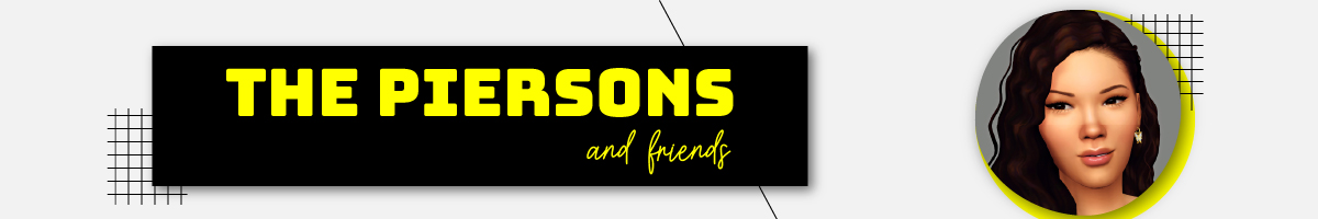
It was clear I needed to go back to my roots with the tree and script font, so I set out to make something new. I also needed to move away from the black and yellow. Even though I could think hard and come up with some deep, philosophical reason for why I use those colors, frankly, there is no reason. I was new to storytelling on Tumblr at the time, and I just did what I saw other people doing. Also, I didn’t have the design knowledge I have now and was just winging it.
Black doesn’t convey organic according to color theory, so I ditched it, made white my primary neutral, and introduced green, which just so happens to be Kameron’s favorite color! I suppose, theoretically, we can pay homage to him for generations after he’s gone, but I’m sure this story won’t be around that long. I also wanted to make the banners more modern to match the present-day setting. After trying a LOT of different designs, this is what I came up with!
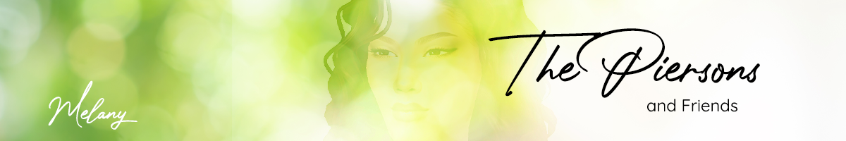
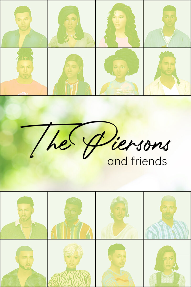
I know, I know. “But, Jess! Where’s the tree???” It’s there! I promise lol. It’s just very blurred and covered in bokeh. I think it works for the modern style. It still feels very organic to me, so it’s working.
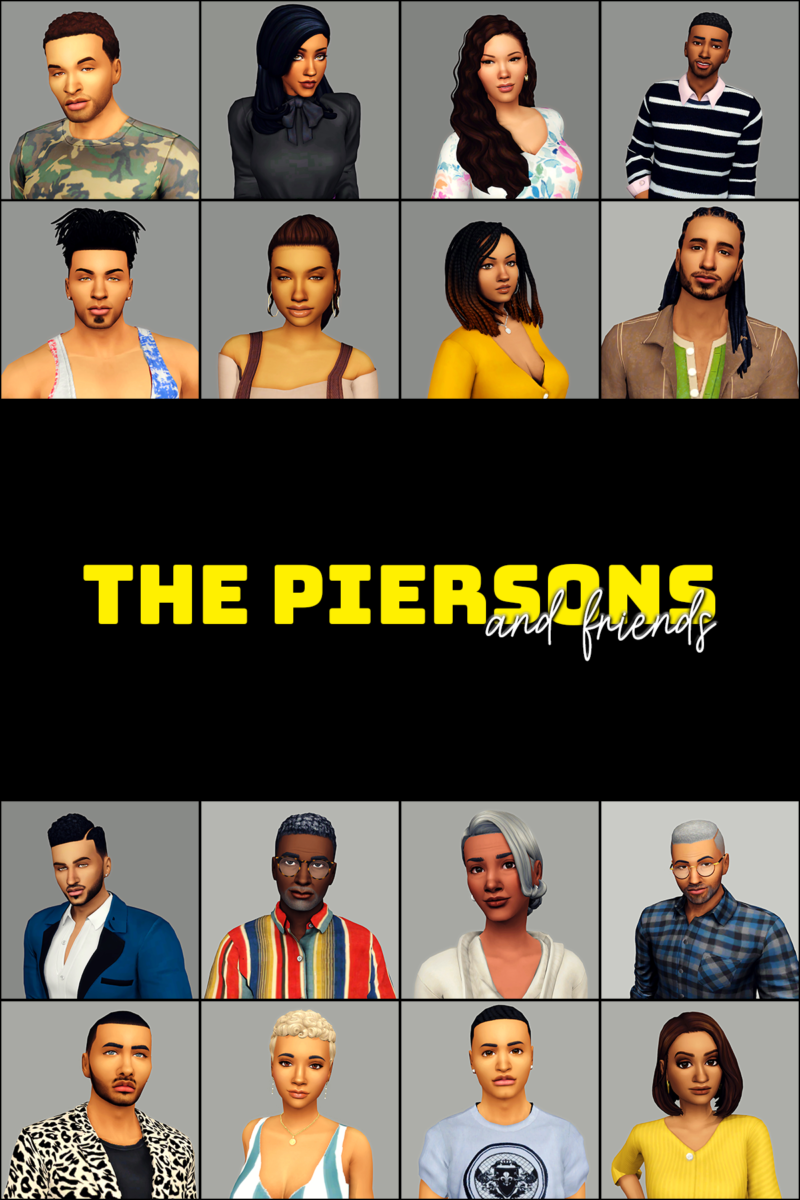
I added the characters’ names to the banner because I think it will help new people who begin reading in the middle.
So what do you think??? Did I accomplish my goals? Does it work for you?
My design brain tells me I should go ALL the way with this branding thing and change my dialogue typeface to the sans serif one I’m using for the subheading. But, a. it only comes in regular, thin, and bold, and not having italics is problematic for me (see what I did there lol), and b. Myriad Pro is perfect for what we do because it’s clean, readable, and has multiple fonts in its family. I experimented with green text, but yellow just works better. Honestly that’s how I started using yellow in the first place. But anyway, that’s my announcement! I hope you enjoy the new hotness!